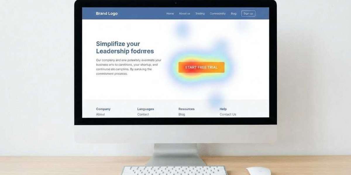

An appealing website that generates no conversions is essentially a costly digital display piece.
Every pigment selected, every gap between sections, every component positioned acts as a psychological prompt. The masterful website designer doesn't merely arrange visual elements—they engineer user choices through systematic behavioral science. These mechanisms operate more methodically than casual analysis reveals.
Pattern 1: Color Guides the Eye Before the Mind Interprets
Color psychology is perpetually misapplied in digital interface design. Designers cite red as urgent and blue as trustworthy, but these are cultural readings of biological functions.
Neurologically, color establishes contrast that directs the fovea—the retina's central zone handling acute vision—toward specific elements before conscious thought intervenes.
Cultural frameworks transform meaning entirely. In Singapore, red connotes luck and prosperity. In Western retail contexts, identical red signals discounts and clearance sales.
Same wavelength. Opposite messages.
Therefore, when your web design agency serves diverse markets, color decisions become strategic geographic choices rather than simple brand expressions.
The practical rule: use brand colors for navigation, headers, logos, and trust signals. Reserve one contrasting accent exclusively for conversion actions.
When your CTA mirrors your navigation palette, users unconsciously filter it out. Not intentionally—the brain simply suppresses repetitive visual patterns to conserve attention.
Pattern 2: White Space Is Valuable Territory Used with Purpose
Clients consistently push for content maximization.
"Can we add more here?" This makes sense—and kills conversions.
Stanford's d.school research shows users remember more when visual groups have fewer items. Three services with breathing room consistently beat nine services crammed together. The issue isn't reading ability; it's confidence signaling. Nine options suggest you're not sure any single offering is worthwhile.
Look at Grab's Singapore homepage versus typical local SME sites stuffed with services, awards, and contact buttons above the fold. Grab shows one clear action. The SME shows forty competing messages. One creates a conversion path.
White space is visual silence. It tells the eye: this matters enough to stand alone.
Pattern 3: Layout Must Follow Natural Eye Patterns or Fight a Losing Battle
Users don't read websites linearly. They scan, following documented behaviors.
The F-pattern appears on text-heavy pages. Visitors read the top strip, scan down the left edge, then dart right when something catches them. The right side gets minimal attention.
That's why trust signals—certifications, logos, awards—belong left or center, never in right sidebars where eye-tracking shows they vanish. Nielsen's documented this since 2006, and mobile makes it worse because the thumb covers the right edge during scrolling.
The Z-pattern governs simple pages: top-left logo, top-right navigation, diagonal to bottom-left, action at bottom-right. That's why converting landing pages put the primary CTA in the bottom-right above the fold. Not design trend—human anatomy.
A skilled website designer builds around these patterns instead of against them.
Pattern 4: Friction Is Built Deliberately, Not by Accident
Strategic friction increases commitment. Sounds wrong until you see the data.
Multi-step forms complete more often when questions go from easy to hard. Ask for name and email first. Ask for budget and timeline last.
Users who start feel invested enough to finish because of the Zeigarnik effect: unfinished tasks stick in memory, creating mild tension until resolved. The incomplete form nags like unread notifications.
The same applies to checkout.
Capture email in step one, payment in step two. This recovers more leads than one long form. Even if they abandon step two, you have their email. The interrupted purchase stays in their head. A timely follow-up closes more than retargeting ads.
Every good web design agency knows this. The goal isn't fewest steps, but best sequence—building commitment at each stage.
Pattern 5: Typography Controls Cognitive Work, Not Just Appearance
Lindgaard et al.'s 2006 study found users form visual opinions in 50 milliseconds. Typography drives this more than most admit.
Serif fonts feel traditional and authoritative. Sans-serif feels modern and clean.
But brand feel matters less than reading mechanics: line height at least 1.5x font size, line length 50-75 characters, body text minimum 16px.
Break these and users tire without knowing why. They don't think "font too small." They feel "something's off" and leave.
Good typography disappears when right. Bad typography feels wrong immediately.
Pattern 6: Social Proof Only Works Where Doubt Lives
Testimonials at the bottom are ignored. Users scroll past them like legal text.
Effective social proof sits right where hesitation strikes. Not star ratings. Not "Excellent service!"
Specific, credible quotes next to decision points: "We briefed them Monday, had wireframes Wednesday, launched in three weeks. Ranked for our main keyword in two months." This answers the exact question users have: will this work for me?
Vague praise sounds fake even when real. Specifics build credibility, not ratings.
The Real Work Starts After Launch
Building the site is guessing. Everything after is learning.
Microsoft Clarity (free) and Hotjar ($32/month+) show heatmaps, scroll depth, and recordings of exactly where users drop off.
The gap between what you expected and what actually happens is where smart design lives. Most sites launch and die. Converting sites launch and keep improving based on real data.
Color, space, and layout don't invent behavior. They tap patterns from every other site users have seen. A smart website designer Singapore aligns with these patterns deliberately. Fight them, and you get a site that looks great and performs poorly.